Introduction
Style Guides play a central role in ProStudio, serving multiple purposes beyond just providing information to the photographer. Attached to products in the Work Order, they specify the details of how each product should be captured, such as the number of required views. The Style Guide in ProStudio serves three key functions:
- Provide clear instructions to the photographer on what to shoot and how to capture it
- Define the criteria for identifying images upon upload
- Establish standardised rules for asset naming
The Style Guide in ProStudio is organised to include essential details about the specific style, followed by a breakdown of all the views included in the guide, such as Front, Back, Detail, and more.
Setting up the Style Guide

To set up a new Style Guide, go to Settings > Style Guides. This will display a list of all the available Style Guides.
To create a new Style Guide from scratch, click on 'Create New Style Guide'.
Note: If you have multiple Style Guides, you can easily search for them. We recommend using a consistent naming convention to make searching more efficient.General settings
 On the first page, you'll be prompted to enter the name and description of the Style Guide. This information will be displayed on the main page.
You can also upload an avatar to showcase an example of the style guide. This image will be displayed on the main Style Guide page.
On the right-hand side, you'll find two buttons:
- Disable Style Guide: This deactivates the Style Guide, allowing you to work on new ones and control when they are published.
- Archive Style Guide: This removes the Style Guide from the available list when it's no longer in use.
Views
 In the 'Create Style Guide' panel, there's a second tab called 'Views.' This tab is used to define all the angles associated with the Style Guide.
Note: You can add multiple views to a Style Guide, but choose to use only a selected few for a specific Work Order.The fields available for each view depend on the attributes you've defined. For more information on configuring these fields, please refer to 'System Configuration: View Attributes.'
Note: If you add avatars for each view, they will be displayed as small thumbnails on the first page.Quick actions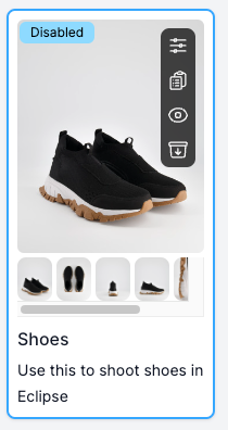
For your convenience, we've added a few quick actions on the first page. When you hover your mouse over an existing Style Guide on the main page, a black panel will appear on the right-hand side.
- The first icon opens the Style Guide for editing
- The second icon allows you to copy the entire Style Guide, making it easier and faster to create new ones
- The third button disables the Style Guide. Disabled Style Guides will display a tag indicating they are inactive
- The last icon archives the Style Guide, removing it from the general listing. However, it can always be retrieved by selecting 'Include Archived' on the main page
Was this article helpful?
That’s Great!
Thank you for your feedback
Sorry! We couldn't be helpful
Thank you for your feedback
Feedback sent
We appreciate your effort and will try to fix the article